This morning I, as many other motor sport fans, got up early to watch the Formula 1 Qualifying session from Japan. An early start, but one I always relish. There is always personally for me something special about Japan. But anyway, the session was fairly eventful with the other Red Bull on pole position. The coverage provided by FOM (Formula One Management), now out of the hands of Fuji Television, was largely fine, even though Jean-Eric Vergne decided to run over a virtual advert!
From there I watched BBC One wind down their coverage, and then I flicked over to Eurosport, to witness the climax of the MotoGP Qualifying session from Sepang in Malaysia. And what a session it was! Helped by a bit of rain before hand, the lap times tumbled down with Marc Marquez taking pole. Again, the coverage was largely fine, and as Toby Moody said in commentary, Dorna’s director did a stonking job when the action was going off all over the shop. So, credit to them there.
As I noted on Twitter though, the big gulf between Dorna and FOM comes with their graphics. Dorna’s graphics are head and shoulders above FOM. Whilst I praised FOM a few weeks back, their basic graphics set needs improvement. For the purposes of this post, I am only looking at the Qualifying sessions as I admit that is what made me tweet this morning.

The above is just as the chequered flag has been thrown. Down the left hand side is a list of the lap times that have been set. We can also see who has already passed the chequered flag and who is in the pits. Those with no symbol are on no flying lap. At the bottom of the screen, we see two drivers current progression around the lap – in this case Nico Hulkenberg and Nico Rosberg. Already, we can see a limitation to the graphics set. We can only see two lap times at the bottom of the screen at a time, due to the lay out. There are ten drivers on laps, which shows a fairly major limitation and a bug bear for me during Qualifying.
Aesthetically, it is pleasing and easy on the eye, the slanting may feel a bit unprofessional, but I can see why they went down that route because of the style of the ‘F1’ logo. The graphics set also makes a clear differential between who is currently ‘in’ to the next part of Qualifying, and who is ‘out’. Finally, a particular drivers’ row lights up whenever he sets a personal best time for the session. How does that compare to Dorna’s graphics set?
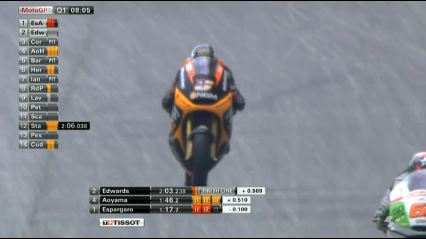
Like I said above, I maintain that FOM’s graphics set looks more aesthetically pleasing. On the other hand, Dorna’s graphics do not feel as cluttered, and shows a detailed amount of information. Whilst it does not have a list of everyone’s lap times, it makes up in that by displaying the current sectors on the left hand side. In FOM’s graphics set, green is simply up on whichever number is to the left of it, or orange is down. Dorna on the other hand has the more traditional red for session best, orange for personal best and grey for no improvement (although this can get confusing if a commentator says that someone has “gone purple!”).
When you look at the example above, Dorna’s graphics set definitely allows them to display more information in comparison to FOM’s system. It may not look fantastic on the eye, but the information is there, and allows you to scroll down the left and see who is setting fast times which is impossible with FOM. The only reason I can think why FOM don’t do that is because green/orange down the side may be confusing to the casual viewer.
Both sets have their positives and negatives. If you are looking for something easy on the eye, then FOM wins, but if you want a data driven set, then Dorna with their MotoGP graphics is a clear winner.

If you or anyone reading is interested, there is a great set of books about Information Design by a guy named Edward Tufte. The basic gist, as relates to this sort of thing, is minimizing “non-ink data” or all the decoration that can simply distract from the information while maximizing the amount of data that can be quickly and intuitively understood. When compared to the nonsense graphics the mainstream sports channels present their stats with, these are both miles ahead of anything else.
All-in-all, though I would love to see more information from FOM. I feel like they could easily provide sector times, or a course map to help show where drivers are. Also, would love to see consideration given to split screen video. We could see Vettel and Hamilton, both live, at the same time. Would be mind blowing.
The irony of Dorna’s graphics being informationally better is that MotoGP is far less strategic than modern Formula 1 (not least due to lack of in-race pit stops in MotoGP). Thus when considering the relative complexity of the sports, F1’s graphics are pretty poor.
Motorbikes tend to divide themselves into easy-to-follow packs during races. MotoGP’s graphics illustrate that fairly well, by grouping riders and then displaying a time gap between groups. That could still be improved by reducing reliance on numbers (which are hard to digest), and displaying the gaps more visually, akin to a simplified circuit tracker. There are still moments during races when one still needs commentary or raw data to pick up on changes – mostly commonly when a rider has picked up the pace suddenly, which isn’t always obvious if riders around them are responding to the pace, but may have a big impact on the race overall. Still the MotoGP graphics do a decent job of explaining the action.
For anyone that thinks F1 graphics are OK, I have a challenge for you: Turn off the TV and “watch” the race via a decent third party timing app, and see what more you learn about the race.
By way of an example, take the last third of the recent Japanese Grand Prix. If you watch this on the television, you’ll see Webber spending a couple of laps not managing to get past Grosjean, while Vettel cruises to glory. If you watch that in data, you’d see Webber power out of his final pit stop going something like 2 seconds a lap faster than both of them, theoretically more than enough to catch and pass Vettel within the race laps remaining. So a battle that on television appears to be for 2nd place is strategically a battle for 1st.
Not convinced? Watch Riccardo from the start of the race, and note how his longer stint caused a traffic jam of theoretically faster cars by laps 15-20. That in turn was the only reason that the top 3 were able to pit and come back without falling into traffic beyond each other: Riccardo’s traffic jam had opened up a pit-stop-length time gap between track positions 3 and 4. Had Riccardo not been running a different strategy, cars like Alonso would have been in the mix with the top 3 during pit stop phases. In terms of understanding why there were just 3 cars at the front, that was critical, but it is all but impossible to determine from the television feed.
The best solution is one I’ve heard, but not yet seen. There’s one (from memory) chap on Radio Le Mans who has got the analysis and communication of this sort of strategic racing down to a fine art. Perhaps we shouldn’t be surprised – Le Mans 24 Hours isn’t just 3 or 4 races in one from the outset, but there are incidents and accidents that routinely move cars around the order, in addition to the more standard strategies on tyres and fuel – so it’s always been difficult to read Le Mans by simply watching it.
In the meantime F1 seems to be stuck in a time-warp, in which viewers are shown a potentially bewildering array of passes, and then Vettel somehow wins anyway. By all means show the on track action – I’m sure some will continue to enjoy it for this alone – but the modern sport could be so much easier to understand and enjoy if it also effectively communicated its strategic elements.
The chap from RLM is Paul Truswell.
Regarding Ricciardo holding everyone, although I had live timing open, there was a graphic showing the lap time difference between Vettel and Ricciardo, which made it obvious he was 2-3s a lap slower.
While you watch the race on your TV, have a laptop set up on the F1.com webpage and you can go to live timing and see all the sector times, plus the difference between the leader and drivers like Ricciardo, also you can determine how quickly a car is catching up with the one in front and work out how many laps before the driver is in a position to overtake, like the Webber chase of Vettel in the Japanese Grand Prix.
As to bringing in colours to identify different bits of data, please consider that 20% of men are part colour blind.
With so many different circuits in the F1 calendar, it is difficult to remember all the bends of each circuit, therefore could the TV presenters push for each camera position to transmit the corner number or name at the top right hand of the picture?