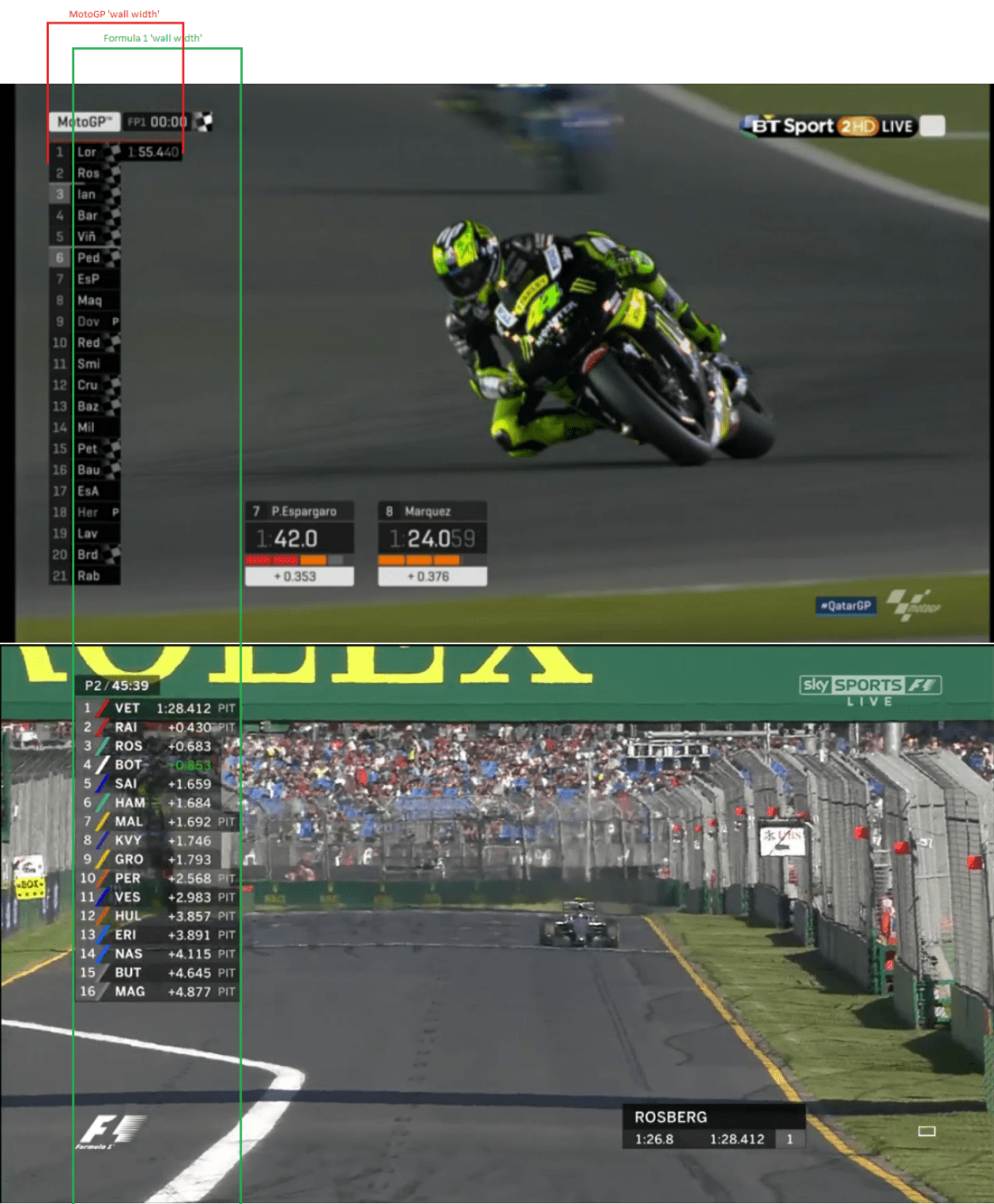
The dawn of a new season means changes not just on the personnel side, but also on the graphical end of things. Last year it was Formula One Management changing its Formula 1 graphics. This year, Dorna have overhauled their graphics set for MotoGP.
The previous graphics set was in itself intuitive and slick. This time around, Dorna have ‘flattened’ the display, with similarities to the Formula 1 graphics that viewers saw last year.

When I reviewed the Formula 1 graphics set this time last year, I said the new graphics set looked “cleaner, slicker and more importantly, they [FOM] take a minimalist approach.”
My initial impression with Dorna’s new graphics is not positive, something does not sit right to me. The timing wall and any written text for that matter, looks far too thin. If your eye sight is not great (like mine), I fear you would be squinting to see who is where in the pecking order. Watching practice, I’ve had difficulty reading the timing wall on both laptop and television.

Like the previous graphics set, it looks like four riders’ laps can be tracked at the same time at the foot of the screen, which is a positive in a qualifying session. There’s certainly an emphasis on displaying the numbers to 1.d.p. (the next two digits are notably darker on both the timing wall and the individual display).
Minimalist graphics are good, but it feels like Dorna may have gone too far in that direction, to the detriment of the look and feel of the graphics set.
This post will be updated with more thoughts as the weekend progresses.
i think its awesome.
so far my initial impression is i think they look great,im certainly not squinting to see the timing wall
Do you remember when the F1 graphics changed in 2004??? The text was tiny at first.. They’ll improve and adjust it… On another note that tower on the left of screen… I hate it… It’s too distracting and intrusive for me.. But like with the small graphics for moto gp i just have to live with it and accept it
I think the positioning is perfect but it could do with being a bit wider. As with all graphic sets they will be improved. However, being very retro, I feel that most graphics used in sports now are pointless. All motorsport has ever needed is a timepiece for qualifying and the race with a stopwatch readout for an onboard car/bike in qualifying. I do understand that it provides the fans with as much info as possible.
The text is hard to read, it’s not sharp or large enough. The black strip at the left side is also far to intrusive..i’m sure this used to be see-through and you could still make out who was coming into shot behind the graphic. Also the silly noises they put over the ‘replay’ graphic is something you’d get on a US motor sports channel… it just sounds naff. The timing boxes are even harder to read because of the text but also the drab colours, but most importantly..this inst a computer game…so why try and make it look like one.!
Dorna is not the only one to have change their graphics this year. ESPN in the US has change it too for their IndyCar coverage for something quite similar to F1 and MotoGP. I think it is only available in North America (very very very old ESPN graphics on the feed outside NA), but you can see it on the replay of the St. Petersburg race on YouTube.
About the changes for MotoGP, I love it ! Same for the new intro and new musics (even if it’s just remixes). I’ve love the grey line going throught the timing wall during the race when the riders complete a lap. The only negative I have is the lost of sectors colors on that timing wall during qualifying.
At least, for those who miss the old set, it’s the new WorldSBK graphics this year.
Where are the rider numbers during qualifying & free practice?
Rider name & position number is not sufficient in equipping you instantly with clarity on appearence of the rider on track.
After all it is the rider number you see out there on track & not the riders name…
Please get this sorted as I’m getting fed up with all the praise Keith & Julian are bestowing upon these sub-standard graphics.
I think the graphics look great, FYI the font is Geogrotesque:
http://emtype.net/fonts/geogrotesque