Touted as being a revolution to the way fans watch Formula 1 around the world, F1’s new on-air package debuted at the 2018 Australian Grand Prix. After the first three races, is the sport living up the hype?
Even at this early stage in the season, there have been several notable changes on-screen to World Feed, although some mooted adjustments have yet to come to fruition.
Music
Historically, Formula 1’s opening sting five minutes each session did not feature the stars of the show. From 1994 to 2002, the sting featured many segments untangling to create the FIA Formula 1 World Championship logo, with a well-loved backing track.
The sting from 2003 to the end of 2017 went through several iterations (2003 to 2008; 2009 to 2011 and 2012 to 2017), predominantly featuring different coloured lines racing around in circles, eventually leading to the F1 logo. Whilst both fulfilled the individual briefs, neither introduced the characters that would feature in the next 90 minutes of action.
The 2018 version, created by Californian based Drive Studio, uses a cut of Formula 1’s new theme song from Brian Tyler, and is twice the length of yesteryear. Critically, the sting introduces the drivers to casual fans, with a fast pace to the theme song. Liberty Media’s mission was to bring the stars to the forefront, and the five-minute sting helps to fulfil that remit.
A minor drawback is that the introduction will need to change in the event of driver moves, so comes with an overhead for Formula One Management. Tyler’s theme has grown in stature so far this season. Some might argue the sting is not as impactful as previous iterations, but the purpose is different, and it satisfies Liberty’s intended direction perfectly.
There was a worry that music would begin to dominate the race broadcasts, but that fear so far is unfounded. Apart from brief interludes for the starting grid introduction and in pre-race parc ferme, music was absent from the race itself. The only interference has come with the replay swipe. The swipe features the sound of a V8 engine, too loudly and to the detriment of the broadcast.
Timing wall – team logo, numbers, and compounds
Last November, as part of the unveiling of Formula 1’s new logo. Wieden+Kennedy (W+K) published mock-ups of what the 2018 graphics set may look like, which raised cause for concern at the time. Like with the music, the concern was unfounded, although there are still drawbacks currently with the timing wall.
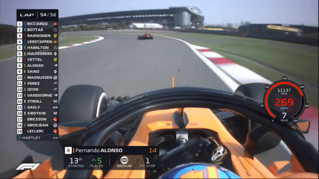
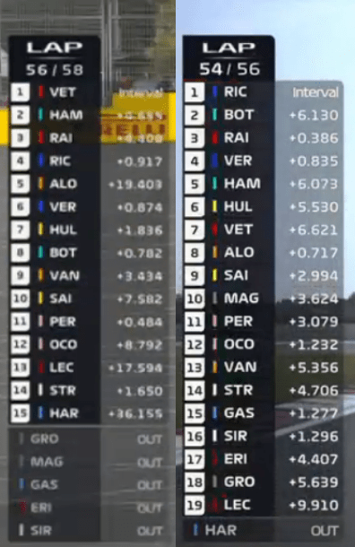
Now in its fifteenth year on Formula 1 television, the latest iteration of the timing wall clearly displays when drivers have moved up or down the order. In the race this is important: if two drivers switch positions the number of the driver that gained the position has their position highlighted in green; with red for the driver who lost out. A simple but positive change (even if it leaves me pulling hairs out at the director, sometimes).
Additional information displayed at regular intervals, such as the team logo and driver numbers. Both show the flexible and dynamic nature of the timing wall to switch between the two at given intervals, which will only help when FOM implements new features.
Tyre compound information is part of this puzzle, as an alternative option to the team logo and driver number, however seems to be less popular with FOM’s television director. The team logos and driver numbers help casual viewers, tyre graphics may confuse them. On the other hand, tyre choice can dictate the outcome of the race as we have already seen in 2018 and should receive preferential treatment.
As a racing fanatic, on the MoSCoW scale, tyre graphics are a must have, but ask a casual fan and they might give you a different answer. It is balancing the priorities. A secondary point is that the tyre graphics need to be accurate, which FOM have struggled with on occasion.
Font sizes and yellow flags
It is important with any kind of graphics set to have a uniform look across its on-air package, with the same font package used throughout and eligible font sizes. F1’s package breaks one of these.
There are two fonts on offer during Formula 1’s broadcasts. The first is a ‘broadcast safe’ font; the second is one of the fonts created as part of W+K’s suite of fonts. A major oversight is that W+K did not create a broadcast safe font, meaning that the graphics set resembles a half-way house where multiple remits are trying to be satisfied (the ‘a’ in W+K’s font does not look good on-screen).
Uniformity is critical throughout the package, and I feel that F1 has some way to go in this space, which is disappointing considering how well 2017’s graphics set fulfilled this (and that is not even accounting for Formula Two or GP3, both remain stranded in yesteryear).
Australia highlighted shortcomings that F1 could have avoided if adequate user testing occurred beforehand, on a variety of devices. In FOM’s defence the timing wall font, which was too small during the Melbourne race weekend, was quickly rectified starting with the Bahrain Grand Prix.
A second basic issue that slipped through the radar concerns the yellow flag graphics. The yellow flag graphic displays over the counter, effectively ‘hiding’ the counter. This becomes an issue when the Safety Car is deployed, as it means the lap counter goes missing for several laps. In China, Formula 1’s television director resorted to displaying the lap counter separately at the foot of the screen next to the F1 logo.
FOM also need to give drivers’ names suitable breathing room within the timing wall, like they did with previous iterations of the wall. Now, ‘Magnussen’ and ‘Hulkenberg’ both feel too squashed, which is a struggle to read if you are not sitting close to the monitor.
Halo impact
Failing to prepare, is preparing to fail. The Halo has been mooted since the events of the 2014 Japanese Grand Prix, and was first agreed in February 2016, although introduction of the device was eventually pushed back to 2018.
The Halo is a device focused on improving safety, aesthetics is a secondary consideration, with no room for experimentation. Could the device bring fans closer to the drivers, through cameras embedded within the Halo? Could the FIA embed a camera within the Halo looking directly at a driver; or a rotating 360-degree camera attached to the Halo?
It appears Formula 1’s television team and the FIA did not discuss the potential impact the Halo would have on traditional on-board camera angles, such as the shoulder length and T-cam angles. This is a problem that Liberty Media have inherited, rather than one of their own doing.
There is also the possibility that the FIA refused (or would refuse) to budge in any instance, believing that the structural integrity of the Halo is of greater importance than enabling a better viewing experience for the television viewer. Nevertheless, after three races the Halo is not detracting from my viewing of F1 as much as I previously anticipated.
Even if the FIA were unwilling to change the Halo, it says a huge amount about the working relationship between the FIA and FOM that no tweaks occurred to the homologated 2018 car design (i.e. positioning of cameras year-on-year) to allow for a better television product.
Camera angles and direction
One of the ethos of Liberty Media heading into the new season was to make the cars look faster on-screen with closer camera angles, more akin to the F1 Digital+ days, and less focus on the advertising surrounding the circuit.
Based on the first three races, Formula 1’s direction this year will be an evolution and not a revolution. Expecting FOM to break old habits straight away is unrealistic, and besides, expecting the likes of virtual advertising to disappear is also unrealistic.
A variety of rumoured elements that would have impacted race direction, such as music (mentioned further up) and a race highlights package at the top of the hour, failed to materialise. That does not mean the initial reports were inaccurate: these were, according to the BBC, discussed during the F1 Broadcasters’ Summit in January. But negativity around the areas, along with other heavily commercialised aspects of the broadcast, resulted in their absence from Australia.
Anyone expecting a revolution might have been disappointed after Melbourne after the pre-season speculation. Nevertheless, FOM have made a few small, but notable steps to improve their race broadcast.

The race direction has improved, as demonstrated in the second half of the Chinese Grand Prix, with all the key action following the Safety Car period covered live. The decision to jump on-board with Daniel Riccardo as he positioned his car to overtake Valtteri Bottas was inspired. Similarly, we were on-board with Max Verstappen’s failed attempt to drive round the outside of Lewis Hamilton.
While the Halo is clearly present in the on-board angles used, the device does not deter from my enjoyment of the action. There is a greater emphasis from the television director on on-board angles in 2018 even with the Halo, and that is only a good thing in my view. The camera angles compared with 2017 are largely the same, although FOM have added angles to help capture the speed, such as on the apex of turn one in China, showing cars swoop in and out of shot.
There is always room for improvement: elsewhere in China the director during the first half should have looked further down the order to Fernando Alonso and Romain Grosjean for the action instead of focusing on the status quo up front. The On-Board Mix was showing this battle to a very small audience when the World Feed airing to millions was focussed on little action up front.
This was frustrating, as fans were ridiculing the race on social media before the Safety Car period because the director was not up to the job. If the director wanted to keep focusing on the leading drivers, I dare say that picture-in-picture was an option here.
Formula Two receives further attention from FOM
An early revolution in 2018 is the attention that Formula One Management is giving Formula Two, with a variety of on-screen additions. Previously, Formula 1’s World Feed treatment towards the championship has consisted of commentary over the feed, followed by podium interviews. This season’s efforts go a step further.
In the commentary box for 2018, Alex Jacques remains lead commentator alongside Davide Valsecchi, with Sky’s analyst Johnny Herbert joining for the Bahrain sprint race. For the first time, Rosanna Tennant provided additional support from pit lane, reporting on any news from the garages as well as interviewing the top three drivers in parc ferme.
Over on social media, Formula 1’s channels are giving the series more coverage, with Will Buxton on hand, helping fans connect to future talent. However, a gap remains on the highlights front.
Formula 1’s highlights are uploaded to YouTube on the same day, whilst Formula Two’s video reel is added to their website several days after the race. Clearly there is a huge gulf between the number of visitors that YouTube has daily compared with the Formula Two website, so ideally Formula Two’s highlights should also be uploaded to the F1 YouTube channel. A relatively simple change could make a huge difference to the championship, which Formula 1 needs to exploit to grow the popularity of the feeder series.
A major negative for me is that Formula Two and GP3 have retained the old graphics set, which feels like a duplication of systems. Moto2, Moto3 and MotoGP all use the same underlying set, coordinated with one another, and all make the migration from one set to another at a given time, so why are FOM unable to achieve this? It makes Formula Two, and GP3, look like the unloved bit on the side.
The edict to Wieden+Kennedy last year should have included Formula Two and GP3, in the same way Moto3 and Moto2’s package is identical to MotoGP, the only minor difference surrounds the logo (‘2’ and ‘3’ instead of ‘GP’).
Other bits and final thoughts
Although F1 TV Pro is not set to begin until Spain, Will Buxton’s presence has been felt in Formula 1’s online content, with a 30-minute Paddock Pass on Thursday previewing the race, and then a further 30-minute show on Sunday evening reviewing the race. Both videos round-up the interview pen pieces with drivers’ that Buxton has covered earlier in the day, with Buxton giving his views in between.
Whether FOM is using Buxton to his full potential compared with his NBC stint is up for debate, I suspect we will see more once F1 TV Pro gets off the line, so it is too early to come to any conclusions yet. Elsewhere on the social media spectrum, the Drivers’ Parade is now airing live on Facebook, which is great news for those that like to see the unedited interviews rather than the trimmed down versions that make Sky’s race day broadcast on a small delay.
In other teething problems, the live speed counter does not add anything to the live broadcast for me and does not appear to serve any purpose. It needs something additional added, as an example, perhaps as the speed increases, seeing other drivers’ top speed at that point may help. Lastly, the graphics set has some jarring colour clashes. The dark red for Sauber’s driver numbers, up against a black background, is one such example.
Overall, the on-air package is not as bad as I feared considering the Wieden+Kennedy mock-ups that appeared as part of the logo unveiling in November. The package unveiled in Australia has the potential to be an excellent package for Formula 1. But for that to happen, a variety of issues outlined above need to be addressed, and rectified.

Qualifying is an area that suffers from the new graphics – when the driver finishes the lap, there’s a gap, then the +/- difference is shown, but not the actual lap time. I’d like to know the actual time instantly, it takes away from the excitement.
I’ve been surprised by some of the changes Liberty have made, such as the font and camera angles with the halo. It’s not the fact that they changed them, it’s the fact that no-one seemed to think it necessary to check what worked before Australia. Calling it amateur is being polite, and the ‘Driver in Danger’ etc stuff is for idiots quite frankly.
During the Chinese race it was evident from the first pit stop that the tyre compound was not being updated in the timing app. It took them most of the race to fix this, problems like this with the app are common although it has improved a bit over the last year. So the F1 TV app wouldn’t inspire me with confidence in terms of reliability.
“.. a revolution to the way fans watch F1 around the world” – I can’t believe Liberty are selling it in this way, after all, isn’t it just an enhanced version of Skys’ Race Control?
Liberty are in serious danger of turning F1 into a farce from a broadcast point of view. Most F1 fans are very knowledgeable, they know and understand the tech, they are passionate about the sport.
What they are not, are people that need on screen graphics saying that the drivers in 4th and 5th positions are “battling for 4th position”. Anyone that does need that information, and anyone who thinks that others need it, are wasting oxygen that the rest of us can use.
I find it quite ironic that where a lot of sites had posters moaning about pay TV and the lack of FTA etc, are now moaning that the *new* F1 Live app (pay TV!) isn’t going to available in their country.
The replay swipe has been changed to a more deeper sounding swoosh and there’s a noise for the fastest lap graphic and team radio (the latter of which can only really be heard when the background is quiet enough)
One thing that you didn’t mention is the twitter feed which sometimes has a spot of extra video content on it from time to time.. sometimes quicker than the Facebook page.. although they’re not as on the ball as formula e in that regard.. the pit lane collision in formula e qualifying and Mortara’s impact with the wall and subsequent crabbing were available within about 10-15 minutes of them happening on twitter.. if F1 wants moments to go viral then they have to consider that idea.. they won’t.. but they should.
Other thing I’d like to see is the F1 Digital+ service returning to how it used to be which would revolutionise coverage for us the fans.. the way on board cameras were used in the super signal were done in a way to make the action more exciting and intense (Schumacher battling Montoya in Brazil in 2001 on the super signal springs to my mind)
The rest you mention is fine for me though and they’re heading in the right direction… apart from that awful font lol
I visited the Long Beach Indycar race on a two week holiday in America, travelling over from the UK. My hotel had ESPN stations so I caught the Pre-race at the opening laps, before falling asleep as it was past 11pm and I’d been up at the track all day.
I remember vividly that one of the plans announced by Liberty was that markets which use MPH would have graphics in MPH, and those using km/h would have graphics in km/h. This was not the case for the US broadcast. It was identical to Sky (which uses World Feed graphics with km/h). I also noticed that the pre-race facts were the same for qualifying and the race (and in units of km) which was a bit stale.
Actually, at Azerbaijan I remember once thet showed first in km/h, then 5 seconds later in mph.
Also, Liberty had promised translations, but so far in latin America we still have the graphics in English.
As a non sky viewer I had to unsubscribe to f1 you tube channel because it kept showing high lights before I watch it.
I often watch IndyCar races on delay, so I have a social media blackout policy.
For example, I strictly use Twitter’s lists, so I can check accounts about politics and videogames without getting spoilers of races.
I just really don’t like the font(s), especially if you’re also following the race on a tablet ‘live timing’ screen (oddly not quite so objectionable on a PC screen). They look like the graphics from a knock-off F1 sim; too ‘in your face’ for me. Overall, though, I think the rest of the new package works reasonably well.
Will Buxton is probably doing the exact same job as his old nbc job.
On you tube. You see him present paddock pass. Ok. I’m from the UK. But will Buxton is DOING THE EXACT SAME SHOW…
Paddock pass used to be posted on you tube on Thursday night’s after press day at a gp. Ok. Not technically legal as it was an American nbc formula 1 show.
Skip forward 4 months too Australia. And the exact same show and exact same format is being used in the official formula 1 you tube channel now.
I actually don’t really have a problem with that. If a format works, why change it just because it’s with a different outlet? If ABC/ESPN don’t want it, why not the F1 You Tube channel? I like Will B, he did a great job with NBC; he doesn’t talk down to the viewers (either new to the sport or old hands), and he seems to have wound down his, occasional, impressions of an over-enthusiastic puppy… All that said, as a lapsed Sky subscriber, I wouldn’t mind seeing Ted’s Notebook on the F1 YT channel too…
Ted’s Notebook is available on the Sky website, usually within 24 hours of it being broadcast.
I actually found the focus on in-car camera angles during overtakes (Ricciardo on Bottas etc) incredibly annoying. I much prefer the usual overhead with in-car for replays. If this is going to be a new trend then I’ll be very disappointed.
I like the new logo and think the theme is decent enough over the driver introductions but it overstays its welcome as it continues over the ‘action zone’ clips for what seems like a couple of minutes. Unfortunately I still think the new font is desperately poor and I can’t see me ever coming round to it.
I much preferred the cleaner, more refined previous suite.
I generally like the changes.
Agree with Dan about qualifying graphics, that’s why clicked reply here. There position changes on the graphics but it displays the words “NO TIME” instead of showing the actual time. The drama is in seeing how close he got, but I can’t see that now! I do have the app but I can’t always watch live.
The music is unintrusive and works well to build you up. The video intro is a bit too long but the new info with the track map and other facts is a welcome addition, it feels like you’re about to play an F1 game!
In the race they show the team affiliation too often on the tower, but like you I’m a long-time fan so I’m looking for it to cycle gap / interval / tyre.
I can see why the new ‘battling for 4th’ thing is there, riffing off MotoGP’s which works well, they only show it when cars are close.
WEC shows highlights every hour. Maybe FOM could show a 30-second piece at half distance, “if you just joined us”, though I wouldn’t want them too often.
I am very impressed by F1’s graphics special effects, such as resizing, collapsing / expanding, fading, etc. I often watch North American broadcasts and they aren’t as advanced.
The color marks next to the driver’s name are a small touch – actually too small. I think that the whole rectangle with the driver’s name should be in color, rather than dark grey.
The halo graphics are over the top. I’m pretty sure that kids and teens will love them.