The 2018 Australian Grand Prix saw Formula One Management (FOM) unveil a new-look to their television product, with a new introduction five-minutes before the race and a new graphics set.
Admittedly, some of the riskier and controversial options on the table, such as introducing a highlights reel half way through the race, did not make it to fruition, for Australia at least. Inevitably, comparisons will be made between this set of graphics and previous iterations. But which set is your favourite? Here is a look at each graphics set, along with a poll at the bottom of this post.
I have made a conscious decision to leave out any of the graphics set from before 1994, as my knowledge of what happened before then in this area is limited. I also am unaware whether there was a consistent graphics set used for complete years, or whether it was the decision of each of the local hosts. What I do know though, is that from 1994, things became a lot more consistent.
Also, the content in this article is copied from the equivalent 2015 version, except with a few minor rewording tweaks here and there, plus a new section for 2018. When I ran this post in 2015 to mark the introduction of the previous set, 748 people voted as follows:
- 14.4% – 1994 to 2003
- 7.1% – 1996 to 2002 (F1 Digital+)
- 9.0% – 2004 to 2009
- 27.1% – 2010 to 2014
- 42.4% – 2015
How will you vote this time around? First, here is a summary of the different packages…
1994 to 2003
Anyone who began watching Formula 1 in the late 1990’s will remember this graphics set fondly. Probably dubbed as the classic graphics set, the World Feed graphics were standardised for the beginning of 1994 and remained in place for a decade.
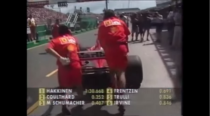
For its time, the graphics did their job perfectly, but towards the end, the graphics set had outlived their welcome as viewers wanted more data and detail, especially those that had returned to the World Feed from the defunct F1 Digital+ platform. Plus, it is fair to say that those graphics would be unsuitable in a widescreen era, and unusable in a three-part qualifying session if not tweaked significantly.
1996 to 2002 – F1 Digital+
Whilst the majority of the world were accustomed to the classic graphics set seen above, a small portion of the audience who subscribed to the F1 Digital+ service across Europe (and in the UK through Sky during 2002) received a different graphics set, which was arguably ahead of its time.

Those who watched via the standard World Feed did see the F1 Digital+ graphics set once, during the 2002 United States Grand Prix, but apart from that, it was hidden away on the pay-per-view service. Once the service collapsed, the graphics set was discontinued, although the collapse of the service was what probably led to the World Feed graphics getting an overhaul for the beginning of the 2004 season.
2004 to 2009
The 2004 to 2009 graphics set was notable given the number of new features that came with it, such as the timing tower, which I do not believe was included in the F1 Digital+ set. This was also the first graphics set that made heavy use of the three lettered abbreviations that are now commonplace in motor sport. What I do not know is whether these were FOM innovations within motor racing, or a trend that began elsewhere – anyone who watches football will know that abbreviations have been around for decades.

Items such as the rev-counter, which commonly appeared on F1 Digital+, soon became integrated into this graphics set. As with every graphics set, the set was adjusted as time progressed, but the basic template remained the same throughout. As FOM made the transition to widescreen for the 2007 season, the graphics set remained within the 4:3 safe area until they were replaced at the end of 2009. It may not have been the flashiest graphics set ever, however it did its job fine.
2010 to 2014
All of the previous graphics set up until 2010 had featured straight lines, either horizontally or vertically. The graphics set introduced at the 2010 Bahrain Grand Prix went for a more slanted approach, this was presumably done so it matched the slanted aspect of the F1 logo. Yes, the graphics did look ‘sexier’ than previous versions, but did it provide anything that the previous versions did not? Well, not really.

When I compared Dorna’s MotoGP graphics with FOM’s graphics in October 2013, I concluded that “if you are looking for something easy on the eye, then FOM wins, but if you want a data driven set, then Dorna with their MotoGP graphics is a clear winner.”
Like the previous version, this set of graphics went through multiple iterations from 2010 until 2014, but the overall vision remained the same, with not much changing under the surface during the five years.
2015 to 2017
Minimalist was the name of the game, and with branding around the world heading that way in the past five years, this iteration of FOM’s graphical package followed that trend. ‘Keep it simple’ is another way of saying it, and I was a fan of this set.

Maybe this set was too clean for what the ‘new’ Liberty Media style Formula 1 brand is trying to be? In terms of value added, again you could argue that FOM did not revolutionise with this graphics set, leading to a stale television product. But what they had was good, in my view. Part of me wishes that FOM iterated with that set, rather than ripping up the form book again for 2018.
But, if the code that generates the graphics is unwieldy, complex and has what is known in the field as ‘technical debt’, then starting back from square one is worth it in the long term.
2018
It was inevitable that with Liberty Media’s take over a new graphics set would arrive ready for 2018. Whilst the new package has potential, and already has several strong points, there are one or two areas that need to change.

The very basic point to start with is that the font size on the timing wall needs to be larger. Compared to the previous two iterations, the size of the font is smaller, making it difficult to read on different devices – squinting at the television is not the best method for watching Formula 1! Secondly, FOM need to iron out the colour clashes (the ‘purple sector’ problem is one of these).
One the other hand, the timing wall is clearly more flexible than the previous iteration with information about the driver, such as their team logo, displayed occasionally to help the newer fan coming into the sport. The wall also clearly identifies when a driver has overtaken someone else in practice or the race, through red and green markers.
A further post will be coming up in the next week or so with detailed analysis looking at all aspects of FOM’s package for 2018. Of course, there are always room for improvements with any graphics set, but, as with the 2015 set, these are mainly tweaks. If the font size does not change moving forward, there should be cause for concern. But, where does the 2018 graphics set stack up for you historically?
Do you like the approach taken by FOM, or do you wish we could travel back in time to the 1990’s and get the ‘black and yellow’ colour scheme back? It is time to have your say in the poll below and as always, your views and opinions are welcome.
