Revealed: Motorsport Broadcasting’s dream F1 presentation team

Over the past 50 years, many voices have graced the small screen to broadcast Formula 1 to the masses in a wide range of territories: from the UK to the US, from free-to-air to pay TV and beyond.

But how many would make Motorsport Broadcasting’s on-air team, and why? To answer that question is incredibly difficult, when trying to account for the different eras, the different broadcasters, the age of the talent in question, and so on.

The fan that ITV was trying to attract in the late 1990s may be different to the fan Sky is currently trying to attract to their offering.

As part of the selection process, I am assuming that age is not a factor, that time has no bounds, alive or deceased.

The cast assembled in my opinion brings together the best of the BBC, Channel 4, ITV and Sky Sports into a super team, with a few surprises thrown in for good measure. Think of it as my version of the Avengers, for use of a better term!

Of course, this is all judgemental (I admit to being openly biased for the next 2,000 words) and that there is no right or wrong answer to this question. The line-up comprises of:

  • 2 x presenters
  • 3 x analysts
  • 2 x pit lane reporters
  • 2 x technical reporters
  • 2 x commentators

So, who is in, and who is out? Revealed, Motorsport Broadcasting’s dream F1 presentation team…

Presenters
Every good on-air presentation team needs a presenter to fit the bill. For me, watching Formula 1, there are two presenters that brought warmth with them whenever presenting the sport.

First up, the BBC’s Formula 1 presenter from 2009 to 2012, Jake Humphrey. Humphrey worked his way through the BBC ranks, from children’s television into BBC Sport, and eventually onto BBC F1 for the start of F1’s return to the Beeb in 2009.

Humphrey’s style was a departure from his predecessors Jim Rosenthal and Steve Rider on ITV. Both Rosenthal and Rider are excellent, top-tier presenters, but Humphrey brought with him an additional element. During that period, it felt like Humphrey was one of us: a fan who happened to be living the dream as F1 presenter.

In my view, Humphrey helped bring us closer to the sport that we love, thanks to his presenting style, bouncing off his co-presenters where necessary.

Alongside Humphrey anchoring the show is Georgie Ainslee (nee. Thompson). Ainslee has been round the motoring circles for years, having been part of Sky’s A1 Grand Prix coverage in the mid-2000s.
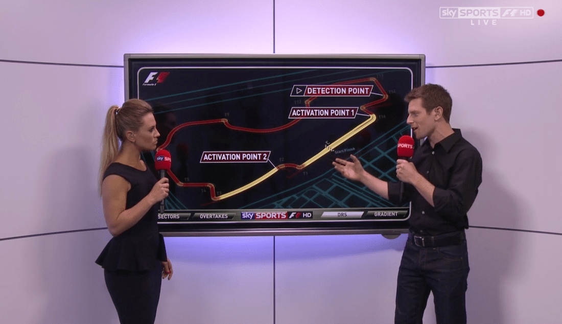
2012 Australian GP - Sky Pad.png
Georgie Thompson and Anthony Davidson analyse the action on the Sky Pad, during Sky’s inaugural race weekend in 2012.

Ainslee was part of Sky’s F1 coverage in 2012, presenting elements of their programming including The F1 Show, but quietly left prior to the 2013 season, with reports at the time suggesting that she wanted a bigger role within the team.

One presenter anchoring the entire weekend is too much, so having two presenters in equal capacity feels the best way to handle the situation.

Back in 2012, I really enjoyed Ainslee’s Sky Pad contributions with Anthony Davidson, and it is unfortunate that she left in the manner that she did, considering she was one of the better parts of Sky’s offering in their inaugural season.

Analysts
This is where the choices get tough, given that there is a plethora of personalities to choose from spanning across the BBC, Sky, Channel 4, and ITV. Narrowing the choices down to three or four stars, past and present, is an extremely difficult challenge. But hey, we did say that this is a dream team.

All three of my choices are natural broadcasters, and all three were part of Sky’s Formula 1 line-up last season. We start with Martin Brundle, 2020 marking his 24th season on the microphone in the commentary box.

Brundle could double up as a third co-commentator, although this piece for brevity keeps Brundle primarily in an analytical role. Alongside Brundle are Sky colleagues Anthony Davidson and Jenson Button, both of whom have shown why they are worthy of being in a dream team in recent years.

Davidson’s broadcasting life started in 2008 alongside David Croft in the BBC Radio 5 Live commentary box, moving over to Sky for the start of their coverage in 2012.

Button joined Sky for five races last year. The thing that lets Sky down is that both Davidson and Button appear on-screen too infrequently across the season, but that is a wider issue surrounding the number of races as opposed to a Sky-specific problem.

On the Sky Pad, Davidson is a wizard, whilst Button has the same characteristics as Humphrey from a broadcasting perspective: a warm style, and a down to earth personality.

If you are looking for entertaining features, maybe this is not the trio for you, it really depends what you are after from a programming perspective.
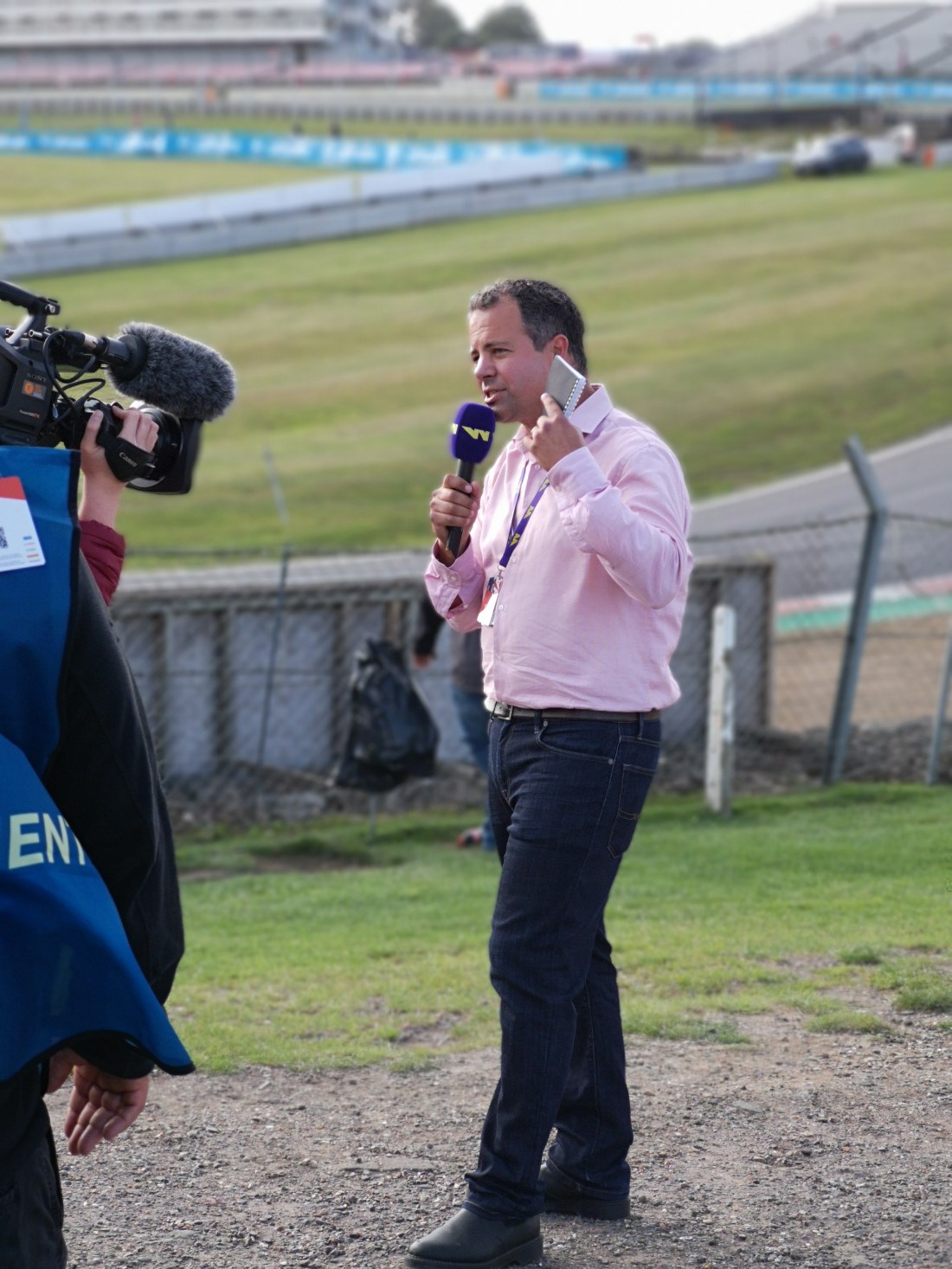
2019 W Series - Ted Kravitz.jpg
Ted Kravitz dissects the W Series action during his Notebook segment.

For me, I want analysts who live and breathe F1, who know it like the back of their hand, and can articulate their knowledge back to the viewer at home in a digestible manner. Brundle, Button and Davidson tick those boxes for me.

Missing out by small margins are Mark Webber, Karun Chandhok and Allan McNish. On a different year in history, the choice may be different.

Also, it is worth bearing in mind that I am looking at this from a UK broadcasting perspective, so opinions may vary depending on where you are based.

Pitlane
Roving the pit lane are two faces, one of whom has never appeared in an official F1 capacity for a UK broadcaster, either through choice or because they overlooked him at every opportunity.

Enter Will Buxton. Currently Formula 1’s digital presenter, Buxton first made a name on the F1 broadcasting scene as GP2 and GP3 lead commentator. More recently, fans stateside heard Buxton’s voice during both Speed’s and NBC’s coverage of the sport from 2010 to 2017.

Despite being around the sport for nearly twenty years, Buxton has never worked in an F1 capacity for Sky, Channel 4, the BBC or ITV at their respective times. UK’s loss was America’s gain over the past decade.

During NBC’s coverage, Buxton and producer Jason Swales hosted several behind the scenes documentaries on the sport, including the ‘Road to…’ series, which was well received by fans.

Joining Buxton is Channel 4’s Lee McKenzie, who has been part of the UK’s free-to-air F1 output since 2009, grilling the drivers on a variety of topics.

Outside of the small screen, both McKenzie and Buxton are brilliant journalists in their own right, both with a unique ability to get the best out of their interviewee on any given occasion: whether in a pre-race vignette, or during the post-race media pen interviews.

You might think two reporters in pit lane and beyond is excessive. But remember, F1 consists of ten teams, 20 drivers, and hundreds of people that help bring the show to life. It is Buxton and McKenzie that get beneath the skin of the sport, helping to tell the stories that may otherwise go unnoticed.
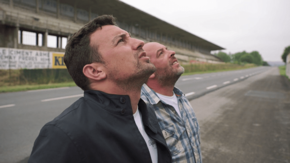
NBC's Road to Mercedes.png
Will Buxton and Jason Swales at Reims for the Road to Mercedes documentary.

Technical
On the technical side, Ted Kravitz leads the output, having been part of the broadcasting scene since the 1990s. Kravitz moved to ITV’s F1 on-air team in a full-time capacity following Murray Walker’s retirement, staying in that role until 2008.

Kravitz moved with F1 to the BBC in 2009, and then again to Sky in 2012, where he has remained ever since, narrowly avoiding the chop from their team prior to the 2019 season. Well-liked by fans, Kravitz’s Notebook has been a fixture of Sky’s F1 coverage since its inception, along with the Development Corner segment.

What Kravitz has never had though, is a good wing man in the technical space, someone to bounce off from time to time. And that is where the second technical expert comes in the form of Craig Scarborough.

With the resources that he has, Scarborough does a great job dissecting the technical innovations across social media, sometimes with Peter Windsor in toe. Both were dropped by Motorsport Network in the latter half of 2018 as part of their cost-cutting exercise at the time.

I suspect no UK broadcaster has ever picked Scarborough up because he has never worked with in an F1 team as technical expert, unlike the likes of Gary Anderson, who was part of the BBC’s F1 offering in 2013 and 2014 before they dropped him.

Nevertheless, if you want an all rounded team that covers both the human element and technical element in equal detail, then you need two technical experts, and Kravitz and Scarborough are the two for me.

Commentators
The beauty of having a broadcasting dream team is that there is no right, or wrong, answer. I started watching Formula 1 in 1999, so caught the later years of Murray Walker‘s commentary.

I met Walker twice: once at a book signing back in 2002, and more recently at Channel 4’s Formula 1 launch in 2016. And, thanks to the internet, many classic races feature his commentary.

  • “And it’s Go! Go! Go!”
  • “Three point three six seconds! Damon Hill wins the Japanese Grand Prix!”
  • “And he exits the final corner for the fifty-third and last time, to win the 2000 Japanese Grand Prix, and the World Championship, for the third time!”

Commentary lines such as these will live on in Formula 1’s history. And it is for that reason that Murray, and his Murray-isms, feature in my dream team. Yes, Walker made mistakes.
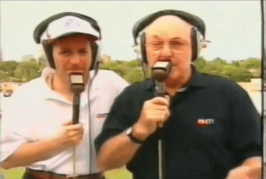
1997 Australian GP - Qualifying.png
Martin Brundle and Murray Walker on the balcony during ITV’s coverage of the 1997 Australian Grand Prix qualifying session.

But, if I had a choice between a commentator that could make paint dry sound exciting, with a few mistakes here and there, or someone who struggled to capture the excitement that F1 brings, it is the former all day long.

To put it simply, Walker’s voice is infectious, and we are lucky that he stayed in the commentary box for as long as he did. Walker will always be F1 to me, and for a whole generation of fans in their late 20s and onwards.

On the other side, one of Walker’s colleagues left this arena far earlier than they should have. James Hunt passed away at the age of 45 in 1993, days after commentating on the Canadian Grand Prix. Had Hunt opted to retire at the same age as Walker, Hunt would still be commentating on F1 today at the age of 72.

I was too young to watch Hunt’s commentary live – I had not even turned one when Hunt passed away. But what I do know is that Hunt in the commentary box was passionate about the racing that was unfolding in front of him, telling it how it was.

It is a testament to the relationship between Hunt and Walker that the pairing lasted 13 years, from 1979 until Hunt’s untimely death.

In a parallel universe, Hunt would have been commentating alongside Walker for many years to come, but alas, it was not too be. In a dream broadcasting line-up, both Hunt and Brundle would be part of that team (clearly, I am bending the rules in the name of fun).

If time had no bounds, this is Motorsport Broadcasting’s dream F1 presentation team:

  • Presenter: Georgie Ainslee
  • Presenter: Jake Humphrey
  • Commentator: James Hunt
  • Commentator: Murray Walker
  • Analyst: Anthony Davidson
  • Analyst: Jenson Button
  • Analyst: Martin Brundle
  • Pitlane: Lee McKenzie
  • Pitlane: Will Buxton
  • Technical: Craig Scarborough
  • Technical: Ted Kravitz

Like with any team, whether the eleven would blend together on-screen is a different question, in the same way that two world class drivers in the best team may go pear shaped.

You want a line-up that is flexible. You do not want a commentator that just commentates, or a technical expert that cannot interview drivers. In the scenario above, Walker would still interview drivers, and Brundle could still commentate, for sake of argument.

Notable by their omission are David Coulthard and Eddie Jordan, amongst other high calibre candidates, which shows how difficult it is to select a dream team cutting across different eras. Had I been focusing on current generation only, then Coulthard and Jordan may well have made the cut.

To bring gravitas to the production is Channel 4’s F1 producer Whisper, but with backing from Sky Sports. Sky bring with them the Sky Pad, the paddock stage set up, as well as the extensive air-time, whilst Whisper bring with them some excellent VTs and a graphics package that is second to none. The best of both worlds, in my view.

And that is my dream Formula 1 broadcasting line-up. What is yours? Have your say and debate the question in the comments below.

Fancy contributing to Motorsport Broadcasting? Head over here for further details…


Contribute to the running costs of Motorsport Broadcasting by donating via PayPal

Poll: Which F1 graphics set do you prefer?

The 2018 Australian Grand Prix saw Formula One Management (FOM) unveil a new-look to their television product, with a new introduction five-minutes before the race and a new graphics set.

Admittedly, some of the riskier and controversial options on the table, such as introducing a highlights reel half way through the race, did not make it to fruition, for Australia at least. Inevitably, comparisons will be made between this set of graphics and previous iterations. But which set is your favourite? Here is a look at each graphics set, along with a poll at the bottom of this post.

I have made a conscious decision to leave out any of the graphics set from before 1994, as my knowledge of what happened before then in this area is limited. I also am unaware whether there was a consistent graphics set used for complete years, or whether it was the decision of each of the local hosts. What I do know though, is that from 1994, things became a lot more consistent.

Also, the content in this article is copied from the equivalent 2015 version, except with a few minor rewording tweaks here and there, plus a new section for 2018. When I ran this post in 2015 to mark the introduction of the previous set, 748 people voted as follows:

  • 14.4% – 1994 to 2003
  • 7.1% – 1996 to 2002 (F1 Digital+)
  • 9.0% – 2004 to 2009
  • 27.1% – 2010 to 2014
  • 42.4% – 2015

How will you vote this time around? First, here is a summary of the different packages…

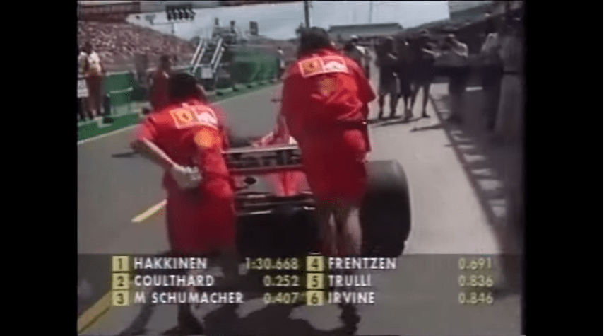
1994 to 2003
Anyone who began watching Formula 1 in the late 1990’s will remember this graphics set fondly. Probably dubbed as the classic graphics set, the World Feed graphics were standardised for the beginning of 1994 and remained in place for a decade.

The classic graphics set on display during the 2000 Australian Grand Prix Qualifying session.

For its time, the graphics did their job perfectly, but towards the end, the graphics set had outlived their welcome as viewers wanted more data and detail, especially those that had returned to the World Feed from the defunct F1 Digital+ platform. Plus, it is fair to say that those graphics would be unsuitable in a widescreen era, and unusable in a three-part qualifying session if not tweaked significantly.

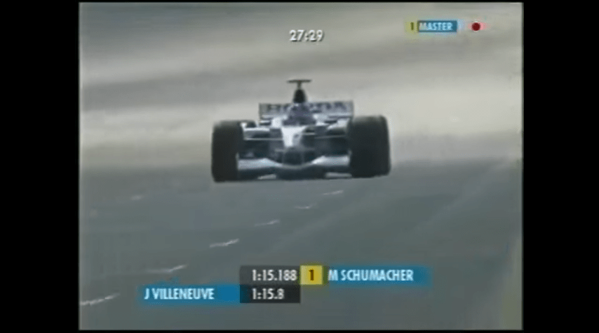
1996 to 2002 – F1 Digital+
Whilst the majority of the world were accustomed to the classic graphics set seen above, a small portion of the audience who subscribed to the F1 Digital+ service across Europe (and in the UK through Sky during 2002) received a different graphics set, which was arguably ahead of its time.

The F1 Digital+ graphics set in action during practice for the 2002 United States Grand Prix.

Those who watched via the standard World Feed did see the F1 Digital+ graphics set once, during the 2002 United States Grand Prix, but apart from that, it was hidden away on the pay-per-view service. Once the service collapsed, the graphics set was discontinued, although the collapse of the service was what probably led to the World Feed graphics getting an overhaul for the beginning of the 2004 season.

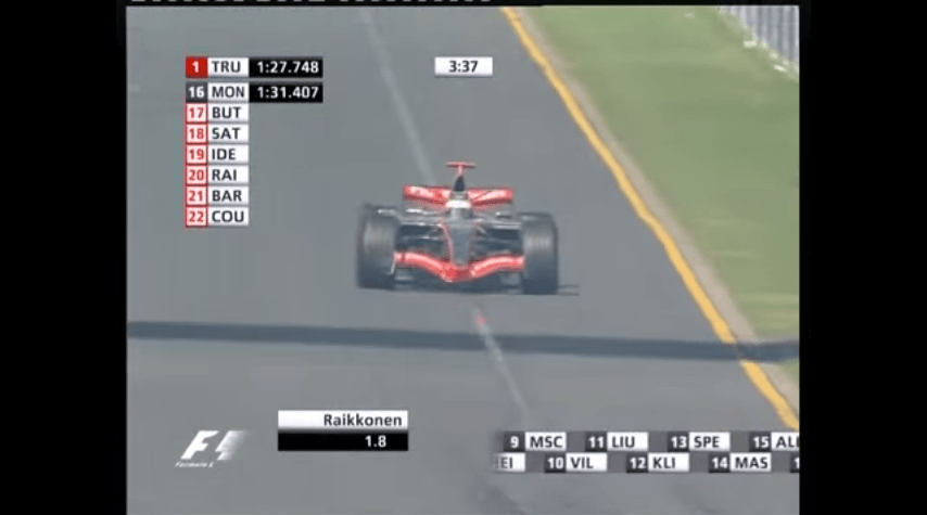
2004 to 2009
The 2004 to 2009 graphics set was notable given the number of new features that came with it, such as the timing tower, which I do not believe was included in the F1 Digital+ set. This was also the first graphics set that made heavy use of the three lettered abbreviations that are now commonplace in motor sport. What I do not know is whether these were FOM innovations within motor racing, or a trend that began elsewhere – anyone who watches football will know that abbreviations have been around for decades.

The no flash, more modern graphics set on display during qualifying for the 2006 Australian Grand Prix.

Items such as the rev-counter, which commonly appeared on F1 Digital+, soon became integrated into this graphics set. As with every graphics set, the set was adjusted as time progressed, but the basic template remained the same throughout. As FOM made the transition to widescreen for the 2007 season, the graphics set remained within the 4:3 safe area until they were replaced at the end of 2009. It may not have been the flashiest graphics set ever, however it did its job fine.

2010 to 2014
All of the previous graphics set up until 2010 had featured straight lines, either horizontally or vertically. The graphics set introduced at the 2010 Bahrain Grand Prix went for a more slanted approach, this was presumably done so it matched the slanted aspect of the F1 logo. Yes, the graphics did look ‘sexier’ than previous versions, but did it provide anything that the previous versions did not? Well, not really.

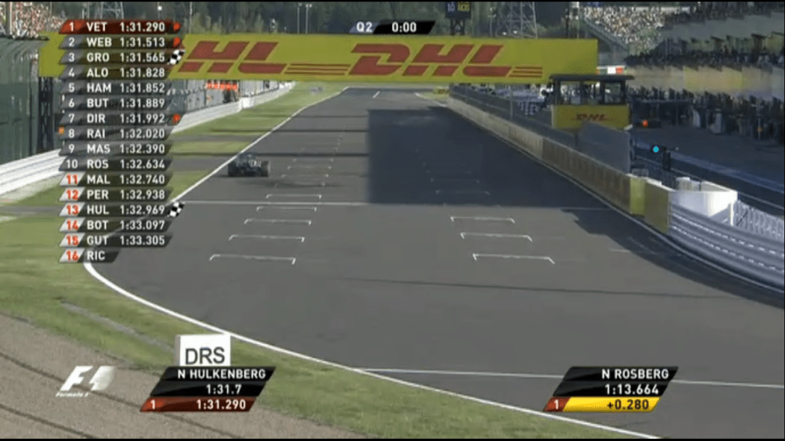
A picture of FOM’s graphics set, as seen during Q2 at the 2013 Japanese Grand Prix.

When I compared Dorna’s MotoGP graphics with FOM’s graphics in October 2013, I concluded that “if you are looking for something easy on the eye, then FOM wins, but if you want a data driven set, then Dorna with their MotoGP graphics is a clear winner.”

Like the previous version, this set of graphics went through multiple iterations from 2010 until 2014, but the overall vision remained the same, with not much changing under the surface during the five years.

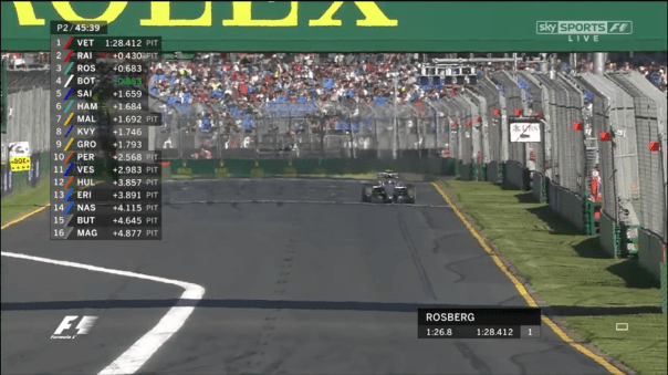
2015 to 2017
Minimalist was the name of the game, and with branding around the world heading that way in the past five years, this iteration of FOM’s graphical package followed that trend. ‘Keep it simple’ is another way of saying it, and I was a fan of this set.

The 2015 to 2017 graphics set on display during practice two at the 2015 Australian Grand Prix.

Maybe this set was too clean for what the ‘new’ Liberty Media style Formula 1 brand is trying to be? In terms of value added, again you could argue that FOM did not revolutionise with this graphics set, leading to a stale television product. But what they had was good, in my view. Part of me wishes that FOM iterated with that set, rather than ripping up the form book again for 2018.

But, if the code that generates the graphics is unwieldy, complex and has what is known in the field as ‘technical debt’, then starting back from square one is worth it in the long term.

2018
It was inevitable that with Liberty Media’s take over a new graphics set would arrive ready for 2018. Whilst the new package has potential, and already has several strong points, there are one or two areas that need to change.

2018 Australian GP - Qualifying.png
Looking at McLaren’s Stoffel Vandoorne during the 2018 Australian Grand Prix qualifying session.

The very basic point to start with is that the font size on the timing wall needs to be larger. Compared to the previous two iterations, the size of the font is smaller, making it difficult to read on different devices – squinting at the television is not the best method for watching Formula 1! Secondly, FOM need to iron out the colour clashes (the ‘purple sector’ problem is one of these).

One the other hand, the timing wall is clearly more flexible than the previous iteration with information about the driver, such as their team logo, displayed occasionally to help the newer fan coming into the sport. The wall also clearly identifies when a driver has overtaken someone else in practice or the race, through red and green markers.

A further post will be coming up in the next week or so with detailed analysis looking at all aspects of FOM’s package for 2018. Of course, there are always room for improvements with any graphics set, but, as with the 2015 set, these are mainly tweaks. If the font size does not change moving forward, there should be cause for concern. But, where does the 2018 graphics set stack up for you historically?

Do you like the approach taken by FOM, or do you wish we could travel back in time to the 1990’s and get the ‘black and yellow’ colour scheme back? It is time to have your say in the poll below and as always, your views and opinions are welcome.

Poll: Which F1 graphics set do you prefer?

Last weekend, at the 2015 Australian Grand Prix, Formula One Management (FOM) unveiled a new graphics set, which on the whole has been well received by blog readers. Inevitably, comparisons will be made between this set of graphics and previous iterations. But which set is your favourite? Here is a look at each graphics set, along with a poll at the bottom of this post.

I’ve made a conscious decision to leave out any of the graphics set from before 1994, as my knowledge of what happened before then in this area is limited. I also don’t know whether there was a consistent graphics set used for complete years, or whether it was the decision of each of the local hosts. What I do know though, is that from 1994, things became a lot more consistent.

1994 to 2003
Anyone who began watching Formula 1 in the late 1990’s will remember this graphics set fondly. Probably dubbed as the classic graphics set, the World Feed graphics were standardised for the beginning of 1994 and remained in place for a decade.

The classic graphics set on display during the 2000 Australian Grand Prix Qualifying session.

For its time, the graphics did their job perfectly, but towards the end, the graphics set had outlived their welcome as viewers wanted more data and detail, especially those that had returned to the World Feed from the defunct F1 Digital+ platform. Plus, it is fair to say that those graphics would be unsuitable in a widescreen era, and unusable in a three-part qualifying session if not tweaked significantly.

1996 to 2002 – F1 Digital+
Whilst the majority of the world were accustomed to the classic graphics set seen above, a small portion of the audience who subscribed to the F1 Digital+ service across Europe (and in the UK through Sky during 2002) received a different graphics set, which was arguably ahead of its time.

The F1 Digital+ graphics set in action during practice for the 2002 United States Grand Prix.

Those who watched via the standard World Feed did see the F1 Digital+ graphics set once, during the 2002 United States Grand Prix, but apart from that, it was hidden away on the pay-per-view service. Once the service collapsed, the graphics were never seen again, although the collapse of the service was what probably led to the World Feed graphics getting an overhaul for the beginning of the 2004 season.

2004 to 2009
The 2004 to 2009 graphics set was notable given the number of new features that came with it, such as the timing tower, which I don’t believe was included in the F1 Digital+ set. This was also the first graphics set that made heavy use of the three lettered abbreviations that are now commonplace in motor sport. What I don’t know is whether these were FOM innovations within motor racing, or a trend that began elsewhere – anyone who watches football will know that abbreviations have been around for decades.

The no flash, more modern graphics set on display during qualifying for the 2006 Australian Grand Prix.

Items such as the rev-counter, which commonly appeared on F1 Digital+, soon became integrated into this graphics set. As with every graphics set, the set was adjusted as time progressed, but the basic template remained the same throughout. As FOM made the transition to widescreen for the 2007 season, the graphics set remained within the 4:3 safe area until they were replaced at the end of 2009. It may not have been the flashiest graphics set ever, however it did its job fine.

2010 to 2014
All of the previous graphics set up until 2010 had featured straight lines, either horizontally or vertically. The graphics set introduced at the 2010 Bahrain Grand Prix went for a more slanted approach, this was presumably done so it matched the slanted aspect of the F1 logo. Yes, the graphics did look ‘sexier’ than previous versions, but did it provide anything that the previous versions did not? Well, not really.

A picture of FOM's graphics set, as seen during Q2 at the 2013 Japanese Grand Prix.
A picture of FOM’s graphics set, as seen during Q2 at the 2013 Japanese Grand Prix.

When I compared Dorna’s MotoGP graphics with FOM’s graphics in October 2013, I concluded that “if you are looking for something easy on the eye, then FOM wins, but if you want a data driven set, then Dorna with their MotoGP graphics is a clear winner.” Like the previous version, this set of graphics went through multiple iterations from 2010 until 2014, but the overall vision remained the same, with not much changing under the surface during the course of those five years.

2015
And so, we come to 2015. The year in which FOM have appeared to rip up anything that existed beforehand and start fresh. The inspiration behind the minimalist approach stems from the way design is heading currently, with big brands going down that route. FOM are only following the trend, and I think they have made the right decision. I’m a really big fan of what we saw over the weekend.

The new graphics set on display during practice two at the 2015 Australian Grand Prix.

Of course, there are always room for improvements with any graphics set, but these are minor tweaks rather than a fundamental flaw in the design. In the poll currently running, 68 percent of you say that you like the new graphics, which is a huge step in the right direction. But, where does the 2015 graphics set stack up for you historically? Do you like the minimalist approach, or do you wish we could travel back in time to the 1990’s and get the ‘black and yellow’ colour scheme back? It is time to have your say in the poll below and as always your views and opinions are welcome.

How much airtime F1 Digital+ had back ten years ago

One thing that I very briefly noted in part 3 of ‘The Verdict so Far’ series was F1 Digital+’s airtime and how long they were on-air before and after practice sessions for their lone season in the UK back in 2002, which I thought would make for an interesting summary in a short blog.

Using a European race as the template, you can see F1 Digital+’s on-air times here, with the European race schedule, for this case Belgium here.

For Friday’s, F1 Digital+ stayed live for the entire day, although the gap between practice sessions was must smaller than what it was now. They were on-air for four hours, with the drivers’ on track for two x 1 hour sessions. As a result, they had half an hour build-up, a gap of approximately one hour in the middle with half an hour of analysis afterwards. On Saturday’s, the two morning practice sessions were 45 minutes each, with a half an hour gap in the middle. Again, F1 Digital+ had half an hour of build-up, and and half an hour of analysis afterwards.

Moving onto Qualifying and the Race however, the airtime was similar to that of ITV F1. For Qualifying they, like with practice, had half an hour of build-up and half an hour of analysis. ITV F1 in the middle of their contract had 30 minutes of build-up for Qualifying (after initially only having 20 minutes of Qualifying build-up for 1997 through to 1999), with 20 minutes approximately of analysis.

F1 Digital+’s warm-up programme on Sunday mornings was two and a half hours, although this is due to the Porsche Supercup, but the build-up is again longer than what Sky Sports F1 have for their practice sessions. For the race, F1 Digital+ had similar on-air length to that of ITV for the pre-show, but like with Qualifying their analysis after the Race was more comprehensive than ITV F1, with F1 Digital+ not going off-air until 15:30 (significantly later than ITV F1 at most races). Of course, F1 Digital+ was only experienced by ten thousand viewers at most per race, the highest figure being twenty five thousand viewers for the 2002 Malaysian Grand Prix. The rest of the three and a half million viewers had to put up with the ITV F1 service, which I shall look at briefly mid-week.