This morning I, as many other motor sport fans, got up early to watch the Formula 1 Qualifying session from Japan. An early start, but one I always relish. There is always personally for me something special about Japan. But anyway, the session was fairly eventful with the other Red Bull on pole position. The coverage provided by FOM (Formula One Management), now out of the hands of Fuji Television, was largely fine, even though Jean-Eric Vergne decided to run over a virtual advert!
From there I watched BBC One wind down their coverage, and then I flicked over to Eurosport, to witness the climax of the MotoGP Qualifying session from Sepang in Malaysia. And what a session it was! Helped by a bit of rain before hand, the lap times tumbled down with Marc Marquez taking pole. Again, the coverage was largely fine, and as Toby Moody said in commentary, Dorna’s director did a stonking job when the action was going off all over the shop. So, credit to them there.
As I noted on Twitter though, the big gulf between Dorna and FOM comes with their graphics. Dorna’s graphics are head and shoulders above FOM. Whilst I praised FOM a few weeks back, their basic graphics set needs improvement. For the purposes of this post, I am only looking at the Qualifying sessions as I admit that is what made me tweet this morning.

The above is just as the chequered flag has been thrown. Down the left hand side is a list of the lap times that have been set. We can also see who has already passed the chequered flag and who is in the pits. Those with no symbol are on no flying lap. At the bottom of the screen, we see two drivers current progression around the lap – in this case Nico Hulkenberg and Nico Rosberg. Already, we can see a limitation to the graphics set. We can only see two lap times at the bottom of the screen at a time, due to the lay out. There are ten drivers on laps, which shows a fairly major limitation and a bug bear for me during Qualifying.
Aesthetically, it is pleasing and easy on the eye, the slanting may feel a bit unprofessional, but I can see why they went down that route because of the style of the ‘F1’ logo. The graphics set also makes a clear differential between who is currently ‘in’ to the next part of Qualifying, and who is ‘out’. Finally, a particular drivers’ row lights up whenever he sets a personal best time for the session. How does that compare to Dorna’s graphics set?
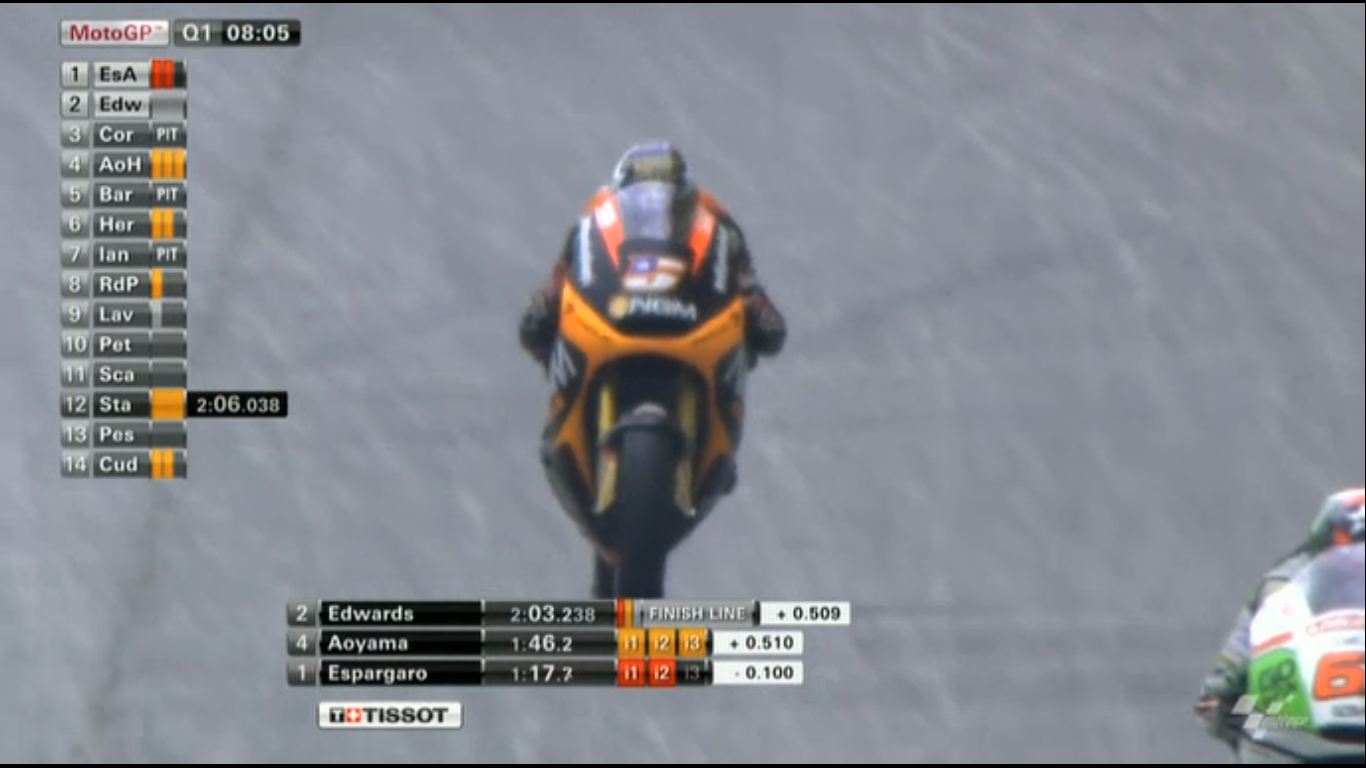
Like I said above, I maintain that FOM’s graphics set looks more aesthetically pleasing. On the other hand, Dorna’s graphics do not feel as cluttered, and shows a detailed amount of information. Whilst it does not have a list of everyone’s lap times, it makes up in that by displaying the current sectors on the left hand side. In FOM’s graphics set, green is simply up on whichever number is to the left of it, or orange is down. Dorna on the other hand has the more traditional red for session best, orange for personal best and grey for no improvement (although this can get confusing if a commentator says that someone has “gone purple!”).
When you look at the example above, Dorna’s graphics set definitely allows them to display more information in comparison to FOM’s system. It may not look fantastic on the eye, but the information is there, and allows you to scroll down the left and see who is setting fast times which is impossible with FOM. The only reason I can think why FOM don’t do that is because green/orange down the side may be confusing to the casual viewer.
Both sets have their positives and negatives. If you are looking for something easy on the eye, then FOM wins, but if you want a data driven set, then Dorna with their MotoGP graphics is a clear winner.
